As I navigate the ever-evolving landscape of website design, I’m continually amazed by the creativity and innovation shaping our digital experiences. Understanding the latest trends is crucial for anyone looking to create compelling digital spaces that resonate with users. In this exploration, I’ll delve into minimalism, dark mode, responsive design, engaging animations, and the vital importance of accessibility. Join me as we uncover how these elements can elevate your website and keep it ahead of the curve.
Minimalism and Simplicity in Website Design

I emphasize minimalism by removing unnecessary elements to create clean, user-friendly interfaces that enhance navigation and focus, a key aspect of UX/UI design.
Whitespace Utilization in Minimalism
I recognize that the proper use of whitespace can significantly enhance readability and draw attention to key elements, resulting in a more engaging user experience and improving visual hierarchy.
To effectively utilize whitespace, I often examine how leading companies like Apple create focus, especially in the context of flat design and clean design. For instance, Apple’s homepage prominently features product images with ample margins, ensuring that viewers are not distracted by clutter.
I find tools like Adobe XD ($9.99/month) valuable for prototyping designs, allowing me to experiment with different whitespace configurations, enhancing page speed and content layout. By starting with a minimalist approach and removing unnecessary elements, I can observe how reducing text density enhances clarity.
Additionally, I consider incorporating breathing room around buttons and images to encourage user interaction, ultimately leading to a cleaner, more navigable layout.
Streamlined Navigation and Site Architecture
I understand that streamlined navigation is essential for reducing complexity and enabling users to find information quickly, which is vital for retaining visitors on my site, improving site architecture, and enhancing user engagement.
To create intuitive navigation menus, I begin by categorizing content into clear sections, utilizing a mobile-first design approach.
I utilize tools like Figma to design wireframes and visualize menu structures before implementing them.
Additionally, I consider conducting A/B tests with different layouts to determine which design keeps users engaged for longer periods, ultimately improving conversion rate optimization.
For example, I can take a page from Amazon’s playbook, which utilizes a multi-tiered dropdown menu that provides easy access to various product categories while minimizing the number of clicks required.
I also make it a point to regularly review analytics to identify any bottlenecks and adjust my navigation as needed. This approach ensures a seamless user experience that enhances visitor retention.
Dark Mode Design and Color Schemes
I have noticed that dark mode design is gaining traction in the industry, as it offers significant visual comfort and helps reduce eye strain for users, particularly in low-light environments, consistent with current design trends 2023.
Benefits of Dark Themes and Color Schemes
Adopting dark themes can significantly enhance user engagement by up to 30%, as they create a striking contrast that effectively highlights key elements, improving visual storytelling and digital branding.
To implement an effective dark theme, I begin by utilizing CSS custom properties and design systems to facilitate easier theme management.
I define a set of variables for colors, such as ‘–background-color: #121212;’ and ‘–text-color: #e0e0e0;’.
I also leverage tools like ‘Dark Reader’ for Chrome to test the theme across various websites. To evaluate user preferences, I conduct A/B tests using Google Optimize, comparing user interactions on my site with and without dark mode.
This approach allows me to gather data-driven insights into potential engagement improvements.
Implementation Tips

Implementing dark mode necessitates careful attention to color contrast to ensure text readability and accessibility across all devices. To create an effective dark mode, I begin by utilizing tools like Adobe Color to develop a color palette that maintains high contrast between text and background.
Incorporating CSS media queries with @media (prefers-color-scheme: dark) allows me to automatically switch styles based on user preferences. Additionally, I include a user toggle option by adding a button to the settings that dynamically changes the CSS class for color settings.
I also ensure that I test the implementation on various devices to maintain consistency and accessibility, ideally using tools such as the WebAIM contrast checker. This thorough approach helps me deliver a user-friendly experience.
Responsive and Adaptive Design Strategies
I prioritize responsive and adaptive design to ensure that my websites perform optimally across various devices, enhancing site performance and mobile compatibility.
This approach significantly enhances user experience and engagement.
Mobile-First Approach and Adaptive Design
Adopting a mobile-first approach allows me to prioritize mobile design, compelling me to consider limited screen space and functionality from the outset, crucial for e-commerce sites and landing pages.
I start by utilizing responsive frameworks like Bootstrap, which streamline the process of creating adaptive interfaces. Before diving into development, I employ tools such as Google’s Mobile-Friendly Test to assess my existing site’s performance on mobile devices, helping me pinpoint critical areas for improvement.
Next, I design with touch interactions in mind, ensuring that buttons are adequately sized and spaced to minimize the risk of misclicks. I also conduct user testing with real mobile users to gather valuable feedback on usability, allowing me to make iterative adjustments that enhance the overall mobile experience.
Fluid Grid Layouts and CSS Grid
I utilize fluid grid layouts that employ percentage-based widths, enabling my designs to adapt seamlessly to various screen sizes and orientations.
To create a fluid grid with CSS Grid, I start with a straightforward HTML structure for my layout, ensuring SEO optimization and fast-loading websites.
I then define the grid container in CSS by using display: grid; and set the grid template columns with percentages, such as grid-template-columns: 20% 30% 50%;.
For instance, I can achieve a three-column layout that becomes fluid by adjusting these values according to screen size with media queries.
Additionally, I implement Flexbox by setting display: flex; and using flex-wrap: wrap; to allow items to flow to the next line, ensuring they fit within the container.
By combining these methods, I am able to create robust and adaptive designs that enhance user experience across different devices.
Microinteractions and Animation in UX/UI Design
I recognize that microinteractions significantly enhance user experience by offering feedback and guiding users through various tasks, improving the overall customer journey.
This approach makes interactions feel more engaging and intuitive.
Enhancing User Experience with Microinteractions

Implementing microinteractions can enhance user satisfaction by up to 40%, making tasks feel more intuitive and rewarding, encouraging user retention strategies.
Incorporating specific examples of microinteractions can significantly elevate my design. For instance, utilizing animated button hover states increases user engagement; I often look to Firebase’s Material Design guidelines for inspiration in this area.
Loading indicators play a crucial role in providing feedback during processing, keeping users informed and alleviating anxiety, ensuring high engagement metrics.
Tools such as LottieFiles enable me to easily integrate animations that are both lightweight and visually appealing. These animations allow me to maintain a dynamic user experience without compromising performance.
I aim to implement at least two types of microinteractions on my key pages to achieve measurable improvements.
Best Practices for Animation
I adhere to best practices for animation to ensure that effects enhance usability without overwhelming or distracting users from the main content. To achieve effective animation in my interface, I follow these specific guidelines:
- I limit individual animations to a duration of 200 milliseconds to maintain user focus.
- Consistency across elements is vital; I use the same animation style and timing for similar actions throughout my interface.
- For creating animations, I find tools like Adobe After Effects or Figma to be excellent choices, as they provide refined control over motion.
- I also test my animations with real users to gather feedback on usability, ensuring they complement rather than detract from the user experience.
Inclusive and Accessible Design for All Users
I prioritize inclusive design in my work, focusing on creating websites that effectively accommodate all users, including those with disabilities.
This approach not only enhances usability but also ensures that everyone can access and benefit from the content provided.
Accessibility Standards and Web Accessibility Standards
Adhering to the Web Content Accessibility Guidelines (WCAG) is essential for ensuring that websites are usable by individuals with varying abilities and is critical for compliance with web accessibility standards.
To achieve WCAG compliance, I focus on specific criteria that make a difference. For instance, I ensure a color contrast ratio of at least 4.5:1 between text and background, which I can easily test using tools like Contrast Checker.
Additionally, I provide alt text for all images to enhance understanding for visually impaired users. Conducting regular audits with platforms such as AXE or WAVE allows me to identify issues and track improvements effectively.
By systematically addressing these areas, I not only meet legal standards but also contribute to creating a more inclusive online experience for everyone.
Tools for Testing Accessibility
Utilizing accessibility testing tools is essential for identifying potential issues and enhancing the user experience for all visitors, ultimately improving compliance rates.
Some popular tools I rely on include:
- WAVE, which provides detailed error reports and actionable suggestions for improvement at no cost, integrating performance optimization and digital marketing strategies.
- Lighthouse, which assesses both performance and accessibility directly within Chrome, supporting integrated SEO.
For those seeking a more comprehensive solution, UserWay offers a $49/month plan that includes real-time audits, UX research, and remediation suggestions.
To effectively integrate these tools into my workflow, I prioritize running audits during the design phase and addressing any identified issues immediately. Additionally, I ensure that I regularly test my website as I add new content, maintaining accessibility standards over time.
Frequently Asked Questions
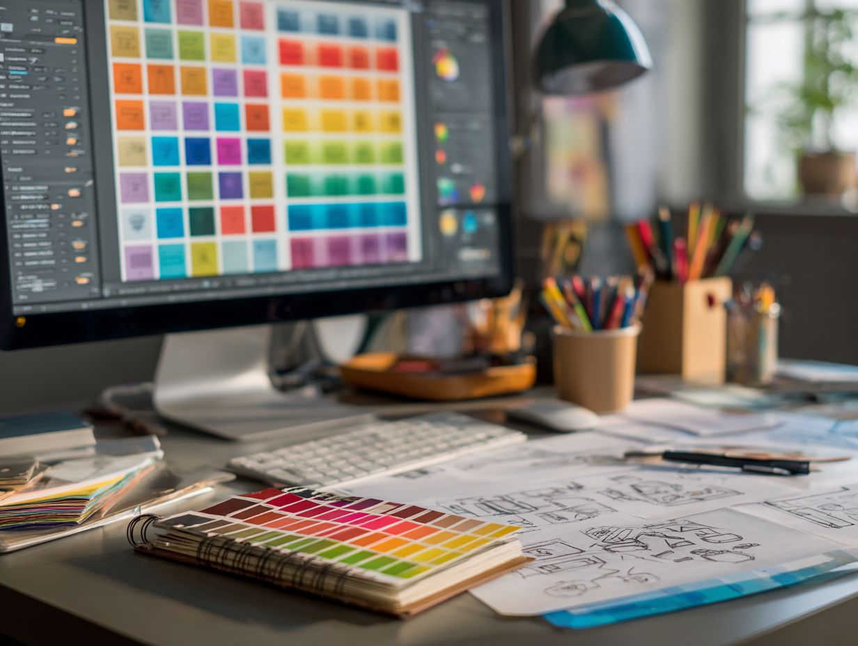
What are the latest trends in website design?
The latest trends in website design include a focus on user experience, mobile responsiveness, minimalistic design, bold typography, dark mode trends, and use of animations and illustrations, along with typography trends and emerging technologies.
Why is user experience important in website design?
User experience is important because it impacts how visitors interact with and perceive your website, influencing brand identity and user-centric design. A positive user experience can lead to increased customer satisfaction and conversions.
How does mobile responsiveness play a role in website design?
In today’s digital age, more and more people are accessing websites through their mobile devices. Having a responsive website design ensures that your site is optimized for different screen sizes and devices, providing a seamless experience for all users, and enhancing SEO optimization and site navigation.
What does a minimalistic website design entail?
A minimalistic website design focuses on simplicity and clean layouts, using plenty of white space and a limited color palette. This trend emphasizes the content and message of the website without overwhelming the user with too many elements, incorporating design thinking and content-first design.
Why is bold typography gaining popularity in website design?
Bold typography can add visual interest and make a statement on a website. It also helps to improve the readability of the content and can be used to create hierarchy and draw attention to important information, supporting brand storytelling and user feedback.
How can animations and illustrations enhance a website’s design?
Animations and illustrations can bring a website to life and add a touch of personality through custom illustrations. They can also be used to convey complex information in a more engaging and visually appealing way, through web animations and infographics.